

Setting the scope
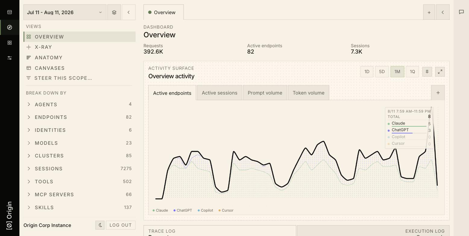
Three controls determine what the four views are looking at.Date range
The selector at the top left sets the window every view uses. If a view looks empty, check this first — a scope with no activity in the window renders as zeros, not as an error.Break down by
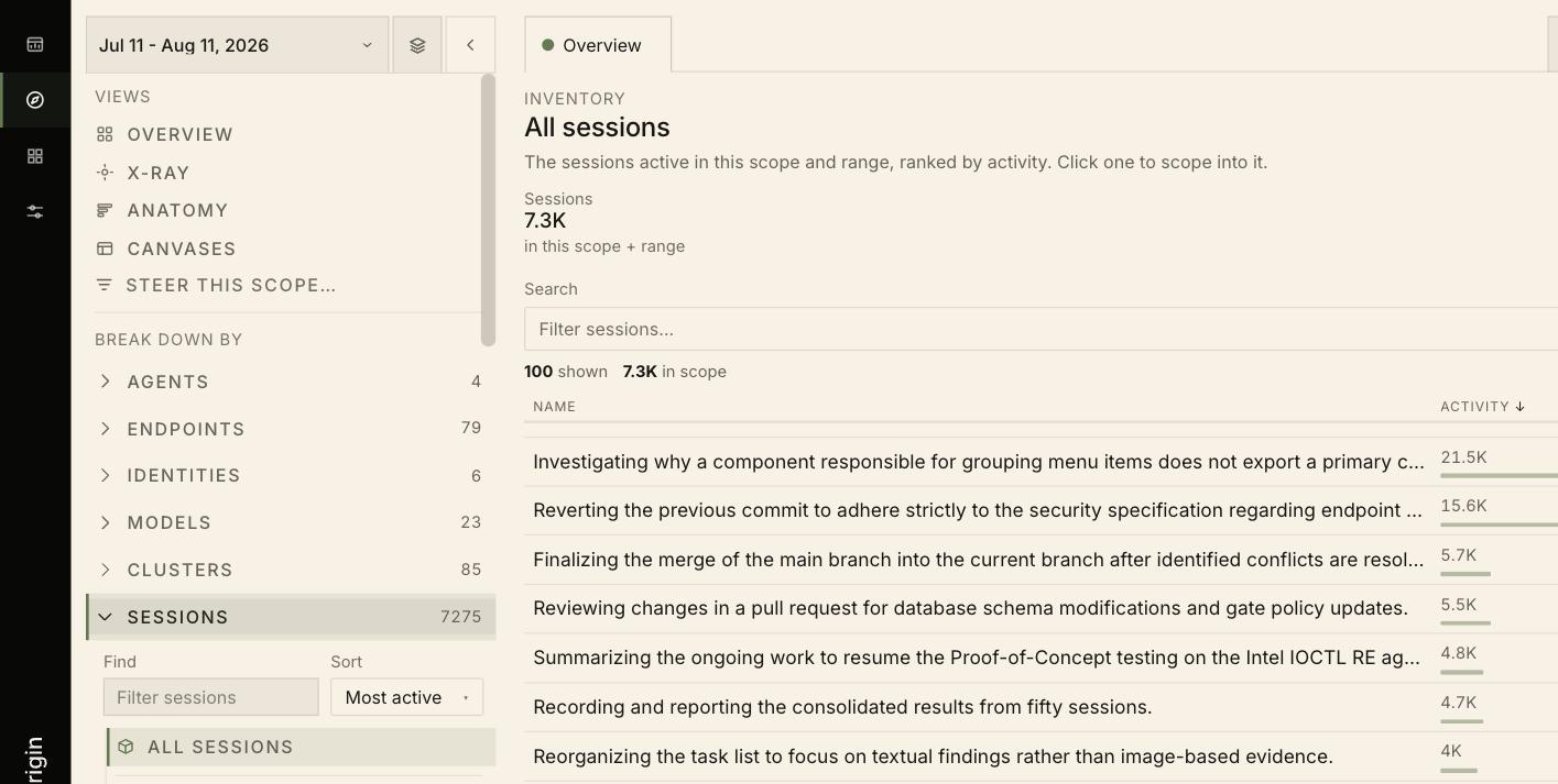
Below the view list, Break down by lists the nine entity types Origin tracks, each with a live count:
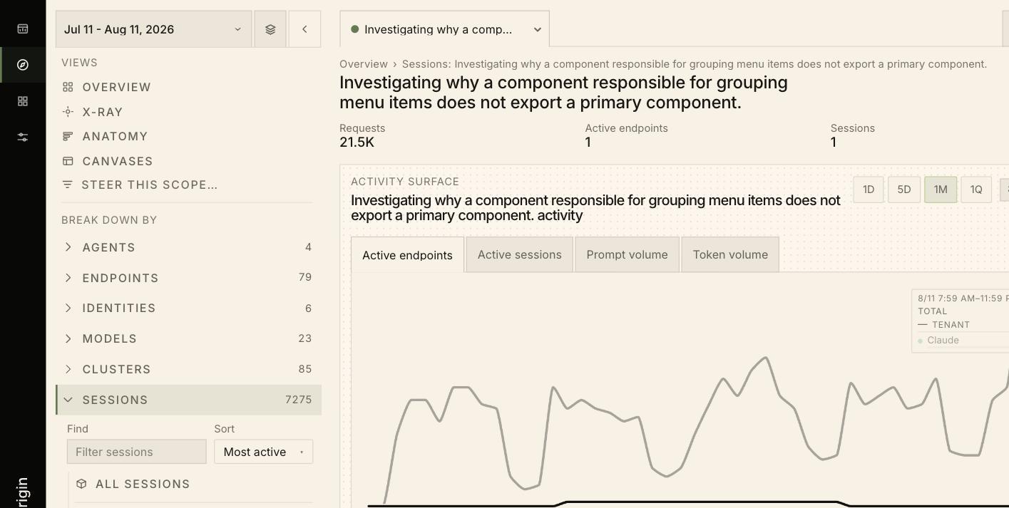
Expanding one gives a searchable, sortable inventory. Sessions, for example, ranks by activity:
Steer this scope
Steer this scope… opens a filter builder for conditions you cannot express by clicking one row — Match (ALL (AND) or any), + Condition, + Group for nested logic, and a Query field showing the text form. Apply re-scopes; Cancel leaves it untouched.
Overview
The default view. Three headline counts — Requests, Active endpoints, Sessions — sit above the Activity surface chart, which plots volume over time broken out by agent, with four series tabs:- Active endpoints — how many machines were active
- Active sessions — how many units of work were running
- Prompt volume — raw prompt count
- Token volume — token throughput, the closest proxy for cost
Request log
Below the chart, every request in scope, newest first: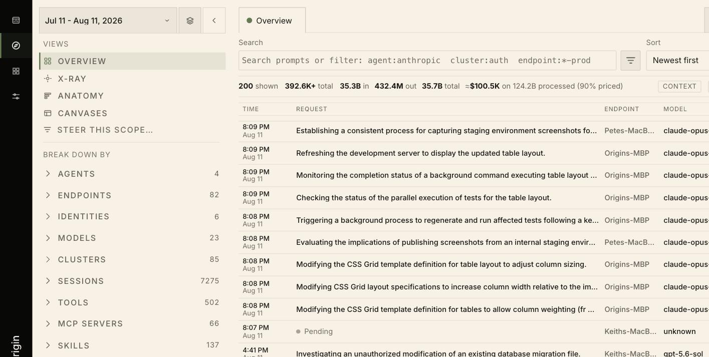
unknown model until they resolve.
Log search filters the log only. To point every view at a narrower slice, change the scope instead.
X-Ray
Overview tells you how much; X-Ray tells you what it is about, by reading prompt text in scope and rendering the language back.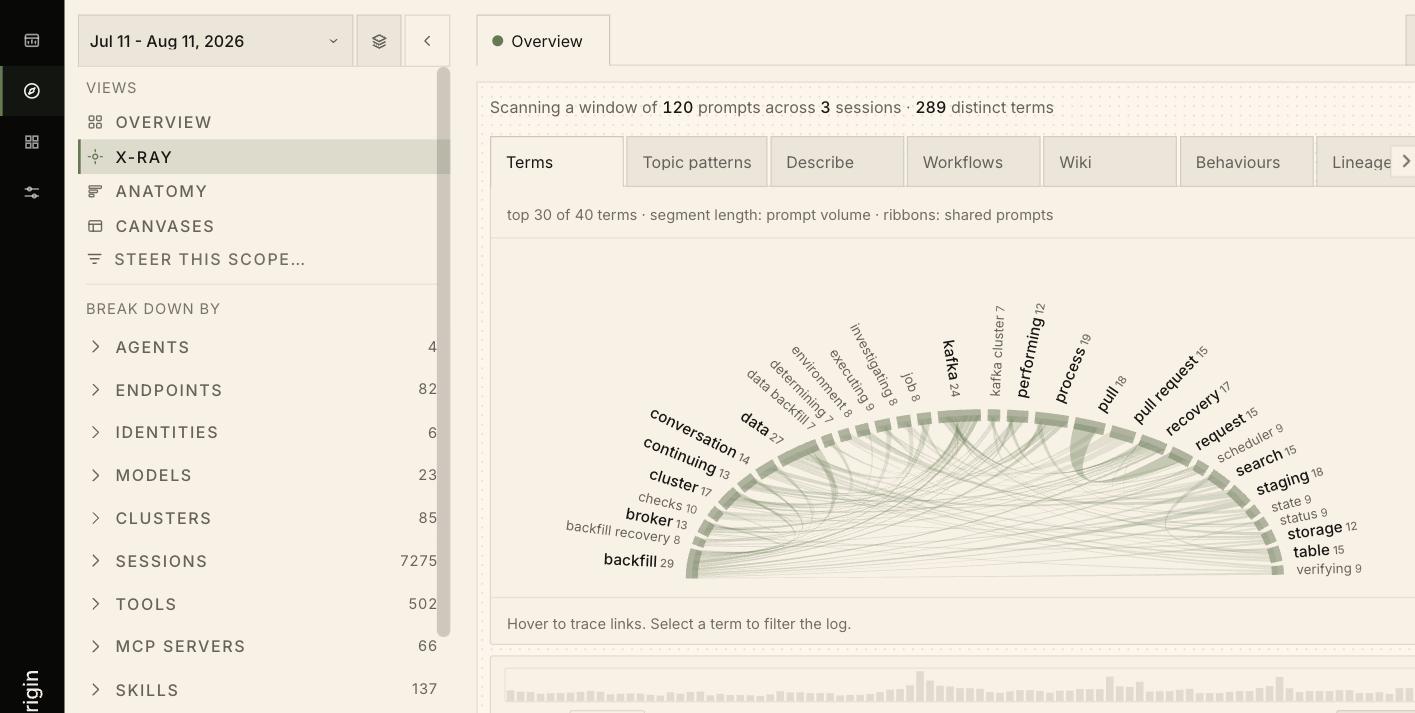
Scanning a window of 120 prompts across 3 sessions · 289 distinct terms — and a Sample control at the bottom sets the size and shows where the window sits in the total.
Tabs offer many different readings of that window — Terms, Topic patterns, Describe, Workflows, Wiki, Behaviours, Lineage, Linear, Research, Git, Grafana, Queries, Recall, Artifacts, Live, and Secrets — with an overflow menu (···) once there are more tabs than fit the strip.
On the default Terms tab, terms sit around an arc sized by frequency. Ribbons link terms that appeared in the same prompts, hovering traces one term’s links, and selecting a term filters the log beneath to just those prompts — the bridge from “this topic is prominent” to “show me the requests”.
Anatomy
Anatomy answers “where does this activity actually sit” — the structure of the scope rather than its totals or its language.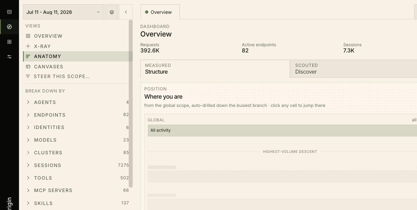
GLOBAL · All activity. Its caption describes what it did:
joe@originhq.com drives ~66% of your organization. Likely one machine’s workflow.”
Canvases
Canvases are multi-widget views assembled from kernels, shown as tabs across the top: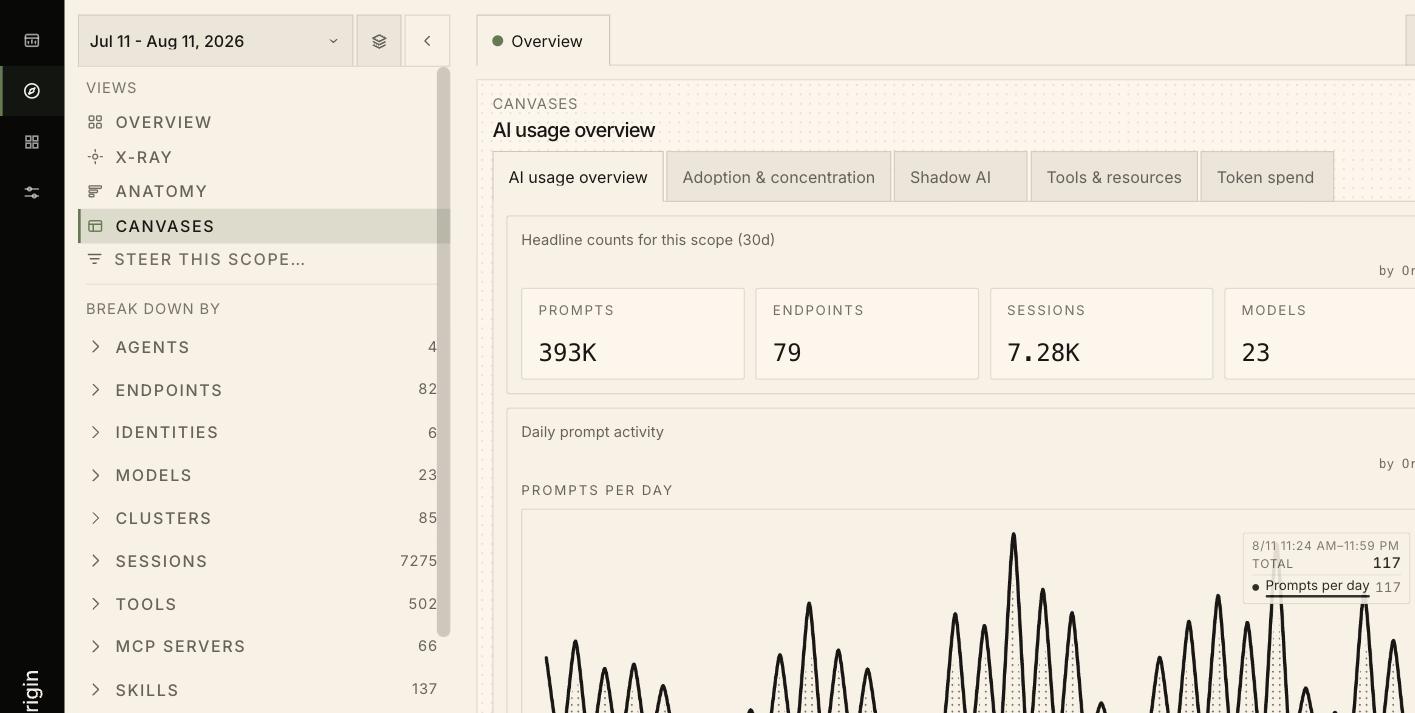
by Origin. To create or edit one, see the Library.